A well-designed menu can mean the difference between a happy customer and a frustrating experience. “The menu is your roadmap to profitability,” says Dan Salem of Salem Foodservice Solutions, “so you got to keep it fresh, you got to keep it clean.”
Here are some tips on how to design your menu to give your guests the best experience while optimizing the sales of your top-selling dishes.
First Impressions
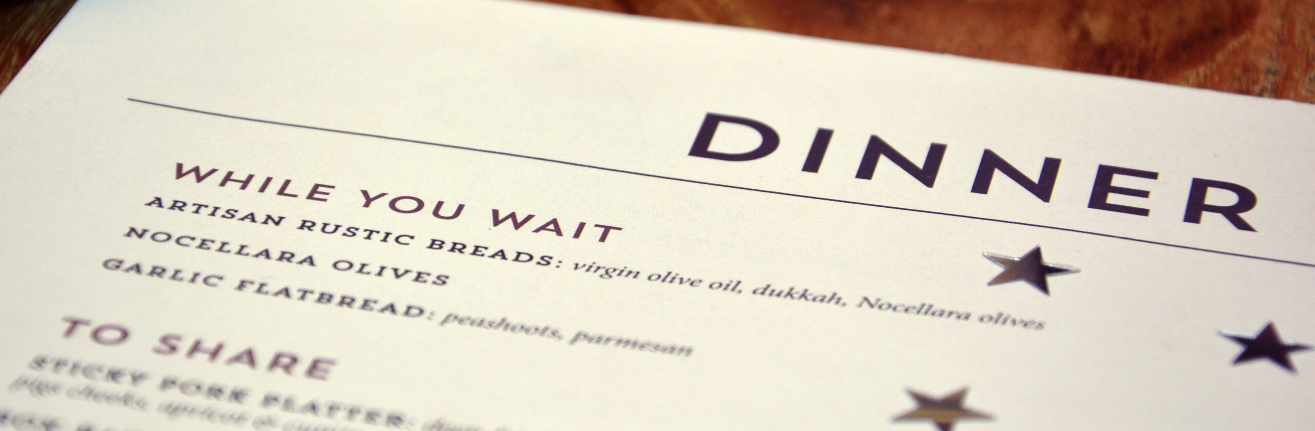
Before you get into the fine details of your menu, consider its overall appearance—for instance, the size. A physically large or lengthy menu can overwhelm your guests and even take up table space. And, depending on how many items you offer, you don’t want your menu too small to the point where it feels crowded. Find that balance in between.
You’ll also want to make sure your words are a legible size. Section names do well in 18–28 font size, while descriptions should stay within 10–14 font size.
The material of your menu says a lot about your restaurant. Should it be printed on paper, a thicker cardstock or plastic? Maybe you’ll want to take it up a notch and put it in a nice leather folder. Either way, be sure to use your brand colors and typeface to tie your menu back to your restaurant.
Where to Place Items
One of the best ways to optimize your menu is to position your items based on how customers read a menu.
“With a basic two-page fold out, the prime real estate is going to be that top right-hand corner,” says Dan Salem. “Typically, diners will look up into that top right, and then they’ll scan over to the top left, scan down, and then they’ll come back over to the middle of the right page. That’s where the majority of the guests go.”
These initial spots are where you should place higher profit menu items based on menu engineering, a method that lets you arrange each menu item based how popular it is and how much profit you make from it.
Place your high-profit, high-selling items in the areas where gazes linger, while the necessary but lower-profit items can move to the dead spots.
“Sometimes you have to have some things, but maybe you don’t want that to be your main seller,” says Sterling Silver® Culinary Director Chef Pete Geoghegan, “so you have to put it in a different spot on the menu. And you can actually control your sales a little bit.”After that, follow the basic principles of design to guide your guests’ eyes where you want:
After that, follow the basic principles of design to guide your guests’ eyes where you want:
- Differentiated items will catch a wandering eye. Try calling out items by placing an outline around it in a striking color, or by using a callout burst that might say “Chef Favorite”
- Colors hold different meanings. Red can mean danger, green usually represents natural, while yellow and orange can make people feel hungry.
- People look at photos before they read text. So if you use only a few photos on your menu, make sure they’re on the items you want to sell the most of.
How to Place Items
Clarity is Key
Beyond anything else, make sure your menu is clear and easy to read. Use large, straightforward category titles to separate sections, like “Appetizers,” “Entrées” and “Desserts.” Or consider separating by type of food, such as “Seafood,” “Steaks,” “Sandwiches” and “Pastas.”
Choose Your Words Wisely
Sometimes, a simple name adjustment can add interest to an item. “I had a client that had a very good fried chicken sandwich, but it wasn’t selling,” explains Dan Salem. “So we changed that item into a ‘Nashville Fried Chicken Sandwich’ and added a sauce to it. If you don’t name it right and it doesn’t resonate with the customer, they’re not going to be interested in it.”
Your descriptions are equally as important. While bigger menus may require shorter writeups (around one to two sentences), smaller menus can feature longer, richer descriptions.
Invest in Good Photography
Because customers gravitate to photos before reading descriptions, a snapshot of your food can make or break a decision. If you have it in your budget, spend some extra marketing dollars on professional photography.
The Right Price
When people see dollar signs, they can perceive that they’re spending more.1 Consider removing the dollar sign and even rounding your prices to the dollar for less clutter on the page. “16” is much more approachable than “$16.73”
More Considerations
- Empty space is good space. It helps reduce clutter and break up sections for easy readability.
- You can reduce distractions by separating drinks and desserts onto their own menus.
- Customers are driven by different motivations today, like gluten-free dishes or humanely raised animals, so include those differentiating callouts when possible.
- Reformat your menu for mobile phone use to make sure it’s easy to digest in a digital environment.
1 Restaurant Engine, 2020

Follow us for more great inspiration
Get the Goods
Our Podcast
SUBSCRIBE & LISTEN NOWHosted by Chef Pete Geoghegan